The World’s Most Trustworthy Messaging Platform
Don’t guess. Verify. The only messaging platform built for trust.
Don’t guess. Verify. The only messaging platform built for trust.

Convenience shouldn’t cost you compliance. Unsecured messaging puts your business at risk. Stirdie gives your business the power to prove trust, in every message, every time.
Phishing emails sent daily (1.2% of email traffic).
Average loss per incident for business email compromise.
Average total cost of a data breach.
Lost to investment scams in Australia during 2024.
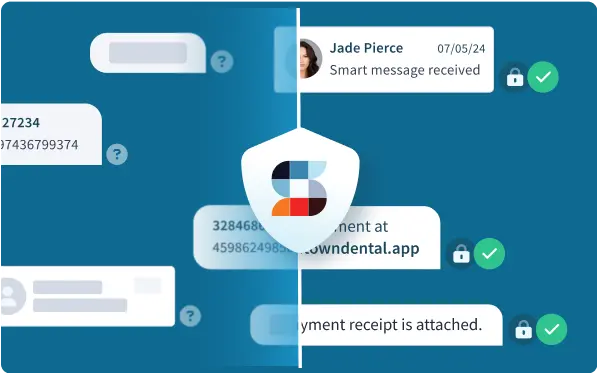
Users verify their identity to earn a verified badge — a visible symbol of authenticity. It’s your way of knowing exactly who you’re talking to, with confidence and clarity.
Messages are locked down from sender to recipient, ensuring no one can access your private conversations and files.
Register your business, add your team, and connect with organizations, customers and individuals.
Every message can be audited, with an unchangeable history that proves if the message and message events have or have not been tampered.
No learning curve, just instant messaging and file sharing backed with trust, transparency and privacy.


-Bradley Davis, CEO
Right now, businesses are securing their spot on Stirdie, building trust, and connecting safely. Being on Stirdie means customers can find you. Getting verified means they can trust you.
🟥 Create your organization and add your team
🟥 Complete your verification
🟥 Connect with customers on Stirdie

Reduce the risks of data breaches with end to end encrypted Stirdie messages and files.

Combat fraud attempts by through verification. Check the identities and view details about businesses to assess legitimacy before engaging.
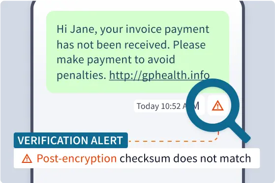
Use immutable blockchain audit trail data to confirm data integrity and data timestamp information.
At Stirdie, we believe trust is earned, not given.
In a world filled with anonymous messaging platforms, we’re building the most transparent and trusted messaging app.
We are redefining trust in messaging. Users can verify identities, audit message data, and communicate with confidence. Trust is a choice, and Stirdie provides transparency in every conversation.
The truth is out there, and so is the risk. Every day, messages are manipulated, identities are faked, and data is exploited. Stirdie promises to give people the tools to verify and control their shared data.
With decades of security expertise, Stirdie is designed with industry leading security practices and compliance at its core, meeting the highest standards for healthcare, finance, and government.
With over 25 years of hard work and innovation, we've evolved from building online fax solutions to online SMS messaging services. Data theft is on the rise, scams are everywhere, we are fighting back with Stirdie — the world’s most trusted messaging app built with blockchain technology to ensure data control, security, and transparency.

Replace hope and assumption with trust and verifiable proof.


